Before diving into design, I conducted thorough UX research. I studied popular tools like Salesforce, HubSpot, and Zoho to evaluate industry standards — and identify usability gaps. I analyzed how users interact with sales data — what they track most, what filters they use, and how often they check key performance indicators.
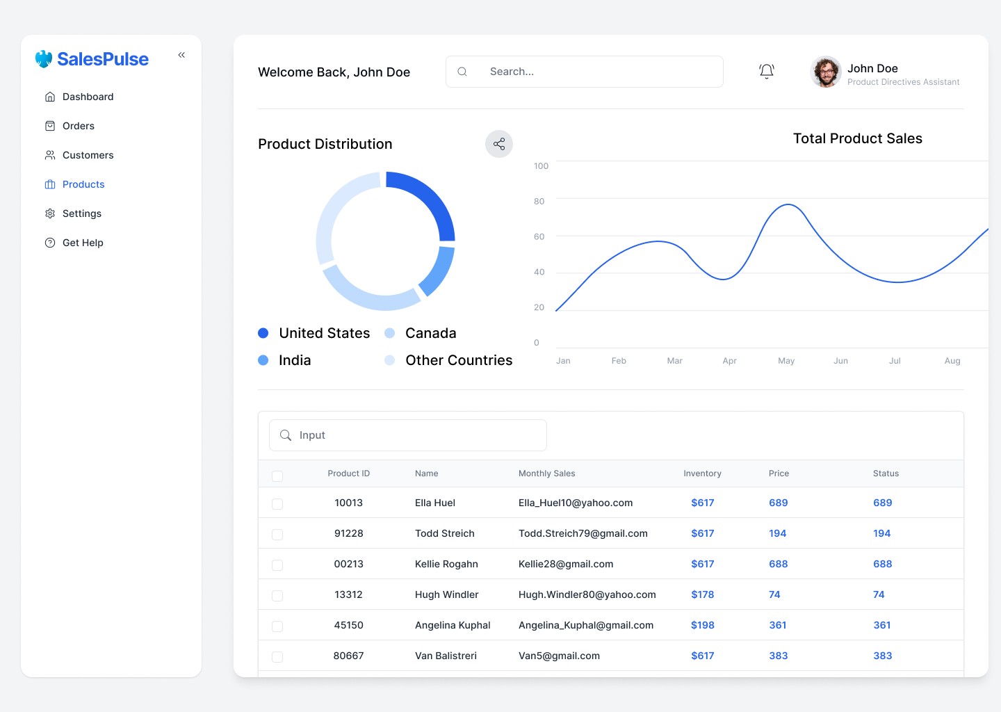
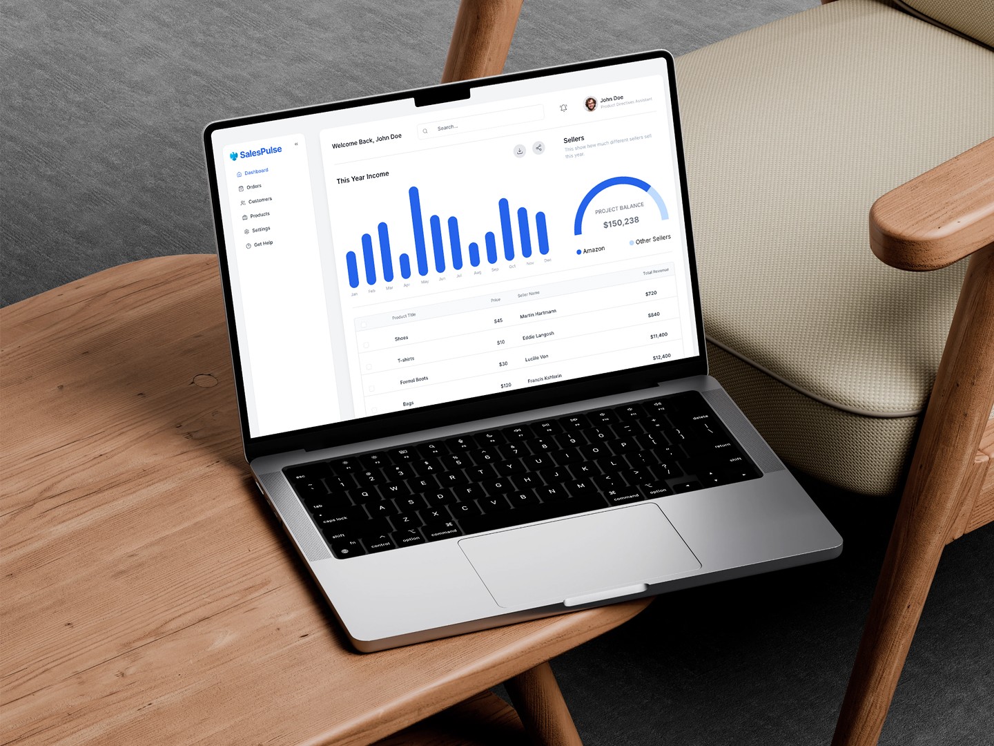
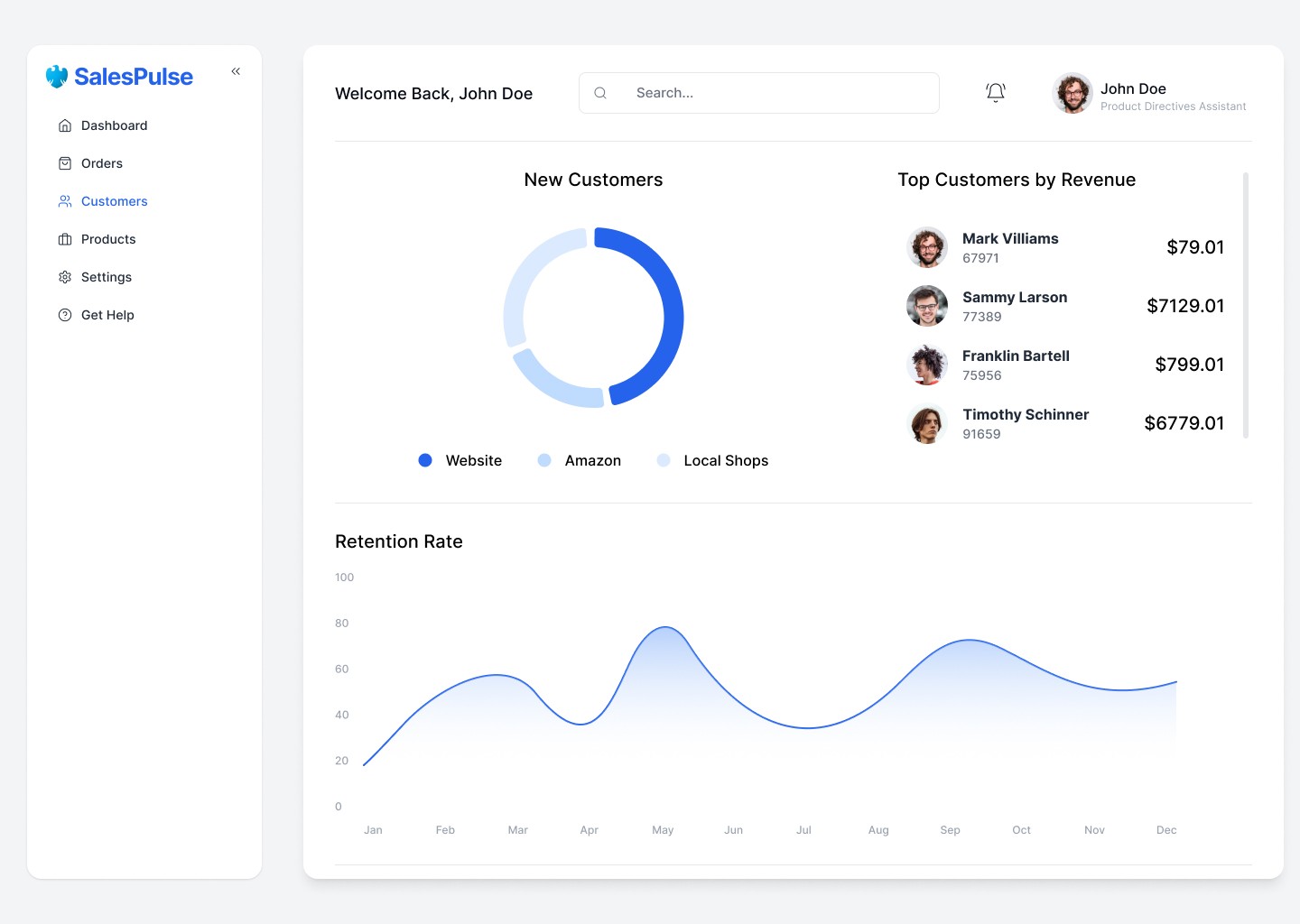
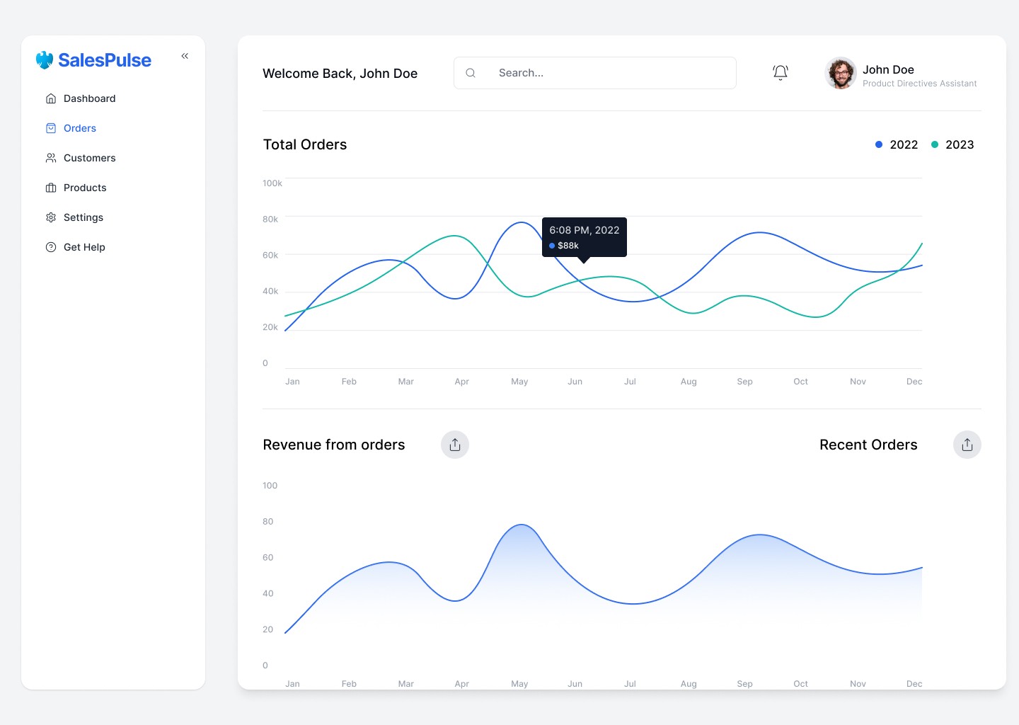
SalesPulse was designed with a sharp focus on clarity, speed, and decision-making. The interface prioritizes clean layouts, strong hierarchy, and intuitive navigation to help sales professionals make sense of complex data in just a glance. I employed a modular card-based layout.
Minimal Distraction: A clean, modern UI using a neutral color base with accent tones for highlights and alerts.
Interactive Visuals: Charts, graphs are fully dynamic to reflect real-time performance.
Hierarchy & Focus: Bold use of typography and spacing to guide attention to critical metrics.
Performance Analytics Dashboard
Forecasting & Goal Tracking
Custom Reports Builder
Smart Notifications & Alerts
AI-Powered Insights (Optional Add-on)
Team Overview Panel
The result is SalesPulse — a smart, adaptive dashboard that transforms raw sales data into clear, actionable intelligence.